
Brand Strategy Tip: You Don't Own Your Followers but You Do Own…
Alex Phoenix, founder of Crimson Creates Studio, writes on platform risk and audience ownership for small business owners and brand builders. This post covers why social media followers are borrowed, not owned; how platforms like Adobe and Upwork have quietly changed terms at the expense of creators; and why building a direct email list is the foundational move for any business serious about long-term brand stability. The post concludes with a call to audit who you are trusting with your brand's growth and how to start building an audience you actually own. Published on crimsoncreates.com. Full essay available on the Crimson Creates Studio Substack.
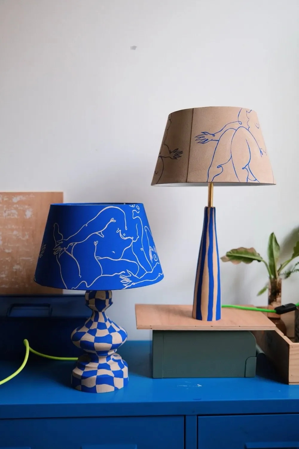
artwork & design by Crimson Creates Studio.
A platform can change its terms overnight. Your email list can't do that.
Adobe is a good case study right now. Artists trusted the platform with their work. The platform used it in ways they never agreed to. Upwork has its own version of this story. So does every platform that quietly rewrites the deal after you've already built your life around it.
This isn't a reason to panic. It's a reason to be deliberate.
Your followers on Instagram, TikTok, and YouTube belong to the platform, but your email list belongs to you. That's the whole game. Build the thing you actually own.
Every platform has a real upside. TikTok builds awareness fast. YouTube compounds over time. But if any one of them goes dark on the day you're launching something, you're the one who absorbs the loss.
What Can Brands do about this?
Be honest about which platforms fit your goals, from the downside as much as the upside.
Align with companies and tools that actually support what you're building. Not just what's convenient right now.
The short version: do an audit of who you're trusting and why. Start with your vision. Build from there.
Or, if you want help thinking it through, that's what strategy sessions are for.
Explore more on Substack:
I go deeper on this in my newsletter — platform strategy, brand building, and what it actually takes to build an audience you own on Substack. I post on there every Tuesday and leave notes/stories about Studio life frequently. Let’s get to know each other there.
Read the Full Breakdown on Substack
— Alex Phoenix, Founder of Crimson Creates Studio
The Silhouette Principle: What Your Brand and Logo Design Look Like When the Lights Go Out
Most logos look great in their brand deck. But strip away the color, the typography, the photography — and ask honestly: is there still something recognizable?
If the answer is no, you don't have a brand yet. You have a very well-dressed idea.
The Silhouette Principle is the first test I run on every identity I design; and it's the same reason Darth Vader is recognizable as a shadow on a wall, Goku is identifiable by a crown of spikes alone, and the Coca-Cola bottle was patented as a shape before it was ever labeled.
The brands (and characters) that last are defined by their form, not their finish. Here's what that means for your small business — and how to know if your brand has the bones to back it up.
The most iconic brands, logos, and characters in the world share one quality; they are recognizable before color, before words, before context. Here is what that means for your small business, and why it matters more than your color palette.
The OG Apple Computer Co. logo vs THE APPLE apple logo
I’ve been talking to my students a lot about this in order to create a impactful drawing, painting, or illustration. I’ve been discussing it so much, and using it in my own process in the past year that I realized I should share more about it. To me, it’s what makes everything good into something beyond great, sometimes… iconic.
There is a test I run on every brand identity I build. I strip everything away; no color, no typography, no photography, no tagline. I reduce the entire visual world down to a single flat silhouette and ask one question: Is there still someone home?
Most of the time, the answer is uncomfortable. Without the warm palette, without the carefully chosen typeface, without the lifestyle imagery, there is nothing left to recognize. The brand dissolves the moment its decorative surface is removed.
This is what I call the Silhouette Principle. Not a formal rule you will find in a textbook; a quiet, ruthless standard I hold myself and every brand I touch to. The idea is simple: if your brand cannot be identified by its shape alone, it does not yet have a shape worth remembering.
"A silhouette is honesty. It is your brand without the costume on; the hidden, readable architecture underneath everything else."
This Is Not Just a Branding Principle. It Is a Universal Law of Visual Communication.
What makes the Silhouette Principle so compelling is that it is not exclusive to brand identity. It is one of the oldest, most consistent truths across every discipline of visual design; logo design, web design, creative direction, character design for film, animation, and games. Anywhere a visual identity has to do real work, the silhouette is the foundation.
Think about Goku from Dragon Ball Z. Before you process the orange gi, before you register the eyes; you know it is him from the silhouette alone. That wild, gravity-defying crown of spikes is so specific, so deliberately constructed, that it reads as a shape before it reads as a character. The same is true of Vegeta's widow's peak and squared jaw; of Piccolo's cape and pointed ears; of Frieza's sleek, alien silhouette. Each of them was designed to be instantly legible in shadow.
Look at Star Wars. Darth Vader's helmet is one of the most recognizable silhouettes in the history of cinema; rendered in pure black on a white page, handed to someone who has never seen the films, and they would still sense something imposing, authoritative, and other. Yoda's ears. R2-D2's squat, cylindrical form. C-3PO's rigid golden posture. Every iconic Star Wars character was designed to be readable at a distance, at a glance, even in total darkness. That is creative direction working at its highest level; a decision made at the concept stage that the form itself must carry meaning before color or texture is ever applied.
Look at the Negative Space around the characters…
Can you say the names of each of the character. If so, then they masterfully have used the Silhouette Principle.
This same logic built the Nike swoosh, the Apple mark, the Target bullseye, and the Coca-Cola bottle (which was so distinct it was patented as a shape, separate from any label or color applied to it). These are not just good logos. They are shapes that have entered visual memory permanently; and that permanence begins at the silhouette.
What This Means for Logo Design
A logo lives or dies by its silhouette. When I work with small businesses in Dallas, McKinney, and the North Texas area on logo design, the silhouette is the first filter I run everything through. Does this mark hold up in black and white? Does it read at the size of a favicon (roughly 16 by 16 pixels)? Is it recognizable as a stamp, a foil, an emboss; all contexts where color disappears entirely?
If the answer to any of those is no, the design is not finished. A logo that only works with its full color palette is a logo that is constantly working against you; every single-color application, every grayscale print, every small-size reproduction is an opportunity for recognition that gets lost.
Good logo design at its core is an act of restraint. It is the discipline of committing to a form so specific and so clear that it can survive the harshest possible condition; no color, no context, no explanation. That specificity, practiced over time, is what turns a mark into a shape; and a shape into an asset that compounds in value with every impression.
"Distinctiveness is not achieved by adding more. It is what remains when you have the courage to take things away."
Silhouette in Web Design and Creative Direction
The principle extends further than most people realize; all the way into web design and broader creative direction. A website's layout has a silhouette too. The way content is weighted on a page, the proportion of whitespace to text, the shape of a hero section or a content grid; all of it communicates something before a single word is read. Strong web design creates a visual rhythm that is identifiable even when you squint your eyes and blur the screen until the text becomes illegible.
In creative direction, this is the discipline of thinking in form before thinking in finish. The strongest creative directors establish the skeleton of a visual world first (its proportions, its spatial logic, its silhouette language) and the color and texture and typography fill in what the form already implies.
For Dallas and North Texas small businesses, this matters practically: does your brand have a recognizable shape across every touchpoint? Would someone scrolling past your social post at speed, catching a glimpse of your van wrap on the 75, or seeing your business card on a conference table have any intuition about who you are? That split-second recognition is the Silhouette Principle doing its work.
The Difference Between a Look and a Language
I think about brand identity the way I think about world-building in literature. The best fictional worlds do not just look different from ours; they feel different. They have their own internal logic, their own gravity. You know when you have left one and entered another.
A brand built entirely from borrowed aesthetics, on-trend color palettes, and fonts that "feel professional" is a brand with a look but not a language. And a look can be replicated. A language cannot.
Pinterest boards are seductive. Canva templates are convenient. The aesthetic of the moment is everywhere, and it is beautiful; and in six months it will belong to everyone, which means it will belong to no one. All of its distinction gone, and along with it the specific, recognizable presence it held for you.
What I want for every brand I work with; whether you are in McKinney, Frisco, Plano, or anywhere across North Dallas; is something more durable than a vibe. I want you to have a shape. I want your business to be recognizable at a distance, in the dark, in another language, on the corner of a tote bag or the side of a building. I want people to feel your brand before they have read a single word of your copy.
That is not vanity. That is strategy; because recognition is trust, and trust is the thing every small business is quietly in the business of building, one impression at a time.
So. Turn the lights out. What is left?
Frequently Asked Questions:
What is the Silhouette Principle in branding?
The Silhouette Principle is a brand design standard that states: if your brand, logo, or visual identity cannot be recognized by its shape alone (without color, typography, or supporting imagery), it does not yet have a form strong enough to build lasting recognition on. It was developed as a working framework by Alexandra Phoenix, brand designer and founder of Crimson Creates Studio in Dallas, Texas.
Why do iconic logos work in black and white?
Iconic logos like Nike, Apple, and the Coca-Cola bottle work in black and white because they were designed with form as the primary asset; not color. Their shapes are distinctive enough to carry meaning without any additional visual support, which is why they remain recognizable across every application, from a foil stamp to a favicon.
How does character design in animation relate to brand identity?
Characters like Goku (Dragon Ball Z) and Darth Vader (Star Wars) are immediately recognizable from their silhouettes alone because their designers committed to a distinctive form at the concept stage; before color or detail. The same principle applies to logo and brand identity design: the most memorable marks are defined by their shape, not their surface.
Where can I find a brand designer in Dallas or McKinney, Texas?
Alexandra Phoenix is a brand designer, logo designer, and creative director based in the Dallas / McKinney, North Texas area. She is the founder of Crimson Creates Studio (crimsoncreates.com) and works with small businesses across Dallas, McKinney, Frisco, Plano, and the greater North Texas region on brand identity, logo design, web design, and brand strategy. She offers complimentary brand audits for qualifying small businesses.
What does a brand audit include from Crimson Creates Studio?
A brand audit from Crimson Creates Studio covers visual identity (logo, color, typography), brand messaging and positioning, digital presence (website and social), and overall brand consistency across touchpoints. Complimentary audits are available for small businesses in Dallas, McKinney, and the surrounding North Texas area.
Work with Crimson Creates Studio.
If this piece stirred something about your own brand's foundation, I would love to take a look. I offer complimentary brand audits for small businesses in Dallas, McKinney, Frisco, Plano, and the North Texas area; no pitch, no pressure. Just a genuine look at where you are and where you could go.
Find me at crimsoncreates.com or reach out directly. I read every message.
Warmly,
Alexandra Phoenix (AP)
Founder and Creative Director, Crimson Creates Studio
Dallas / McKinney, Texas · crimsoncreates.com
Brand Better. Design Daringly.
I’m speaking at the McKinney Millhouse Next Week! Come Join!
Tools for Small Businesses to Thrive in an AI-Obsessed World
Make it stand out
Sign up for my event today! I am superbly excited about providing value and thought explorations to someone whose own industry is impacted in real-time and the adjustments I’ve made to grow, and my observations as well.
Tuesday, March 24, 2026 · 11:30am – 12:30pm · Millhouse at the Cotton Mill, McKinney, Texas · Free & open to all!
What we'll explore
The talk is titled Tools for Small Businesses to Thrive in an AI-Obsessed World and it covers a lot of ground I've been thinking about deeply; both as a brand strategist and as someone who worked inside AI development before it became a household conversation.
We'll look at what AI actually does well (and what it simply cannot do). We'll talk about the growing cultural hunger for the handmade, the human, and the real; why serifs are back, why the "messy girl" aesthetic is thriving, and why Hermès chose a human illustrator over a rendering engine for one of the most visited brand websites in the world.
We'll explore branding as a sensory experience rather than a performance; websites that feel alive, print materials that engage the senses, and communication channels that build genuine trust over time. We'll also discuss visibility in a changing digital landscape; including the very valid and increasingly popular choice to remain faceless in an age of deepfakes, digital fatigue, and online scams.
And we'll close with something practical: a short brand archetype exercise that will leave you with a clearer sense of who you are as a brand, who you serve, and how you want to show up in the world.
This is not a talk about adopting every new tool.
It is about understanding what is happening; then choosing, with intention and on your own terms, how much or how little you want to engage.
Because the businesses that will thrive in this moment are not the ones who chase every trend. They are the ones who know exactly who they are; and build from there.
Event details
The Lunch Bunch Speaker Series is an informal conversation series hosted at the Millhouse at the Cotton Mill in McKinney. The event is free and open to all; members and nonmembers welcome. Lunch is not provided but you are absolutely welcome to bring your own.
Tuesday, March 24, 2026 11:30am – 12:30pm Millhouse at the Cotton Mill · McKinney, Texas